Last few weeks, I’ve been posting macro views to understand where we stand from macro point of view. Now its time to leave my macro hat aside and look at the markets from the micro perspective and see what the bottom up view is. Although, I’ve been posting my view on twitter very frequently, yet here’s far more detailed view.
ES (Weekly): That breakout that seemed, isn’t a breakout afterall? Yes, on the daily chart it seemed like we actually broke out of that ascending triangle, but the close hasn’t been as bullish as it should have been, as the price close just above that red line. It’s a touch and go for the bulls as well as bears. Next week would get more crucial and I would place my trades with tight stops on either side. Being bullish would mean targeting 4325.
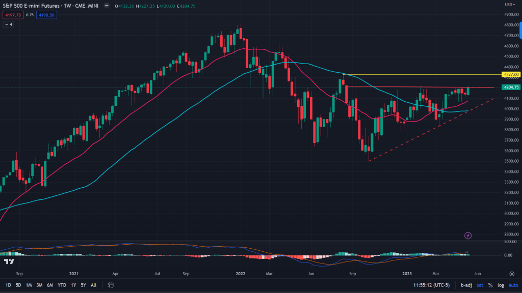
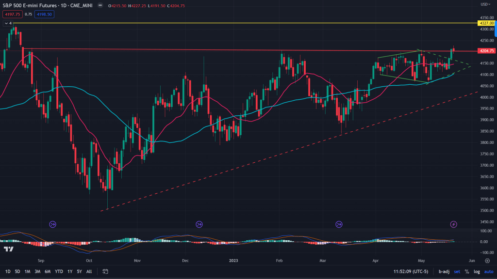
ES (Daily): But what goes in bulls’ favor is the diamond breakout which has been forming for the past one and half months. It has the potential to take them where it matters – beyond 4200 to all the way to 4325.
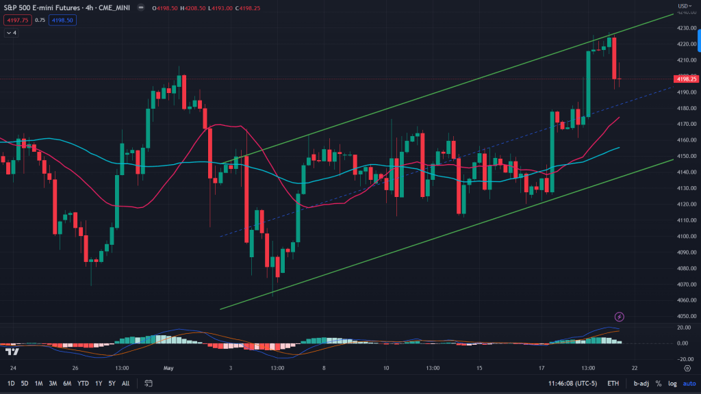
ES (4H): 4H has some exhaustion showing up though, with price retracing from upper end of that channel and momentum fading too with MACD diverging negatively.
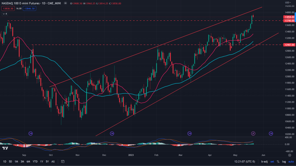
NQ (Weekly): While NQ broke out of that supply line of 13740, but the risk of failed breakout still hanging with price being just under that upper end of the rising wedge. I won’t be bullish here. Not yet.
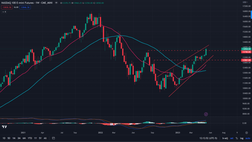
NQ (Daily): What aides to the bears is the losing momentum – MACD diverging negatively. Yes, I won’t be bullish here.
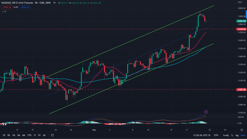
NQ (4H): 4H has all the more reasons for bulls to start trimming. Price retracing from the upper end of the channel and negatively diverging MACD too.
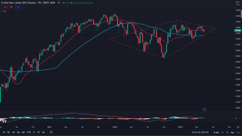
YM (Weekly): Dow Jones Industrial has been the outperformer when markets rallied from that bottom last year. Ever since, it hasn’t been able to lead. What gives? This diamond formation is scary for the bulls. But..
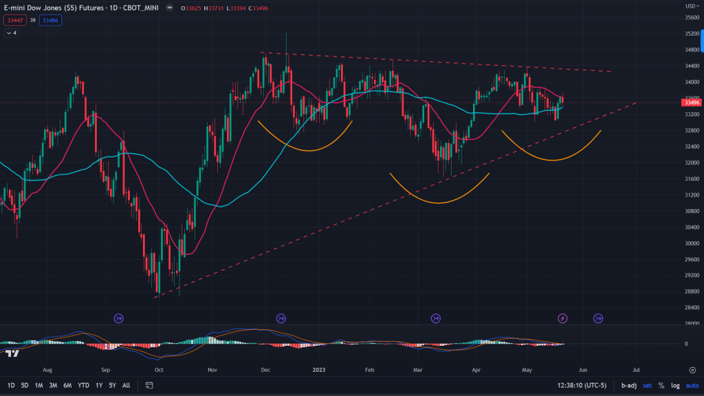
YM (Daily): On the daily, there is a formation of inverse H&S along with ascending triangle – a combination that would be enough for the bulls to cheer. 34,400 would be the breakout line.
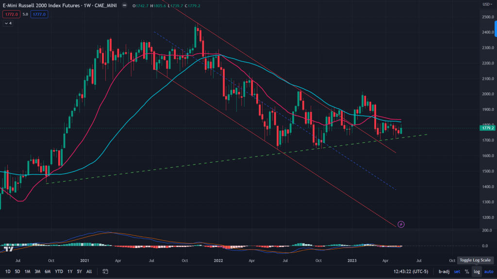
RTY (weekly): If you’ve been trading for years, you would know where to look for when markets top out or bottom out – Its the small cap stocks that hint you all that you need. RTY has not at all participated in in this rally since the bottom of last year and that’s not a good news for the bulls. It is barely holding on to that support line (green dotted line). It has been testing the support for 5 times in the last 10 weeks. You better buckle up.
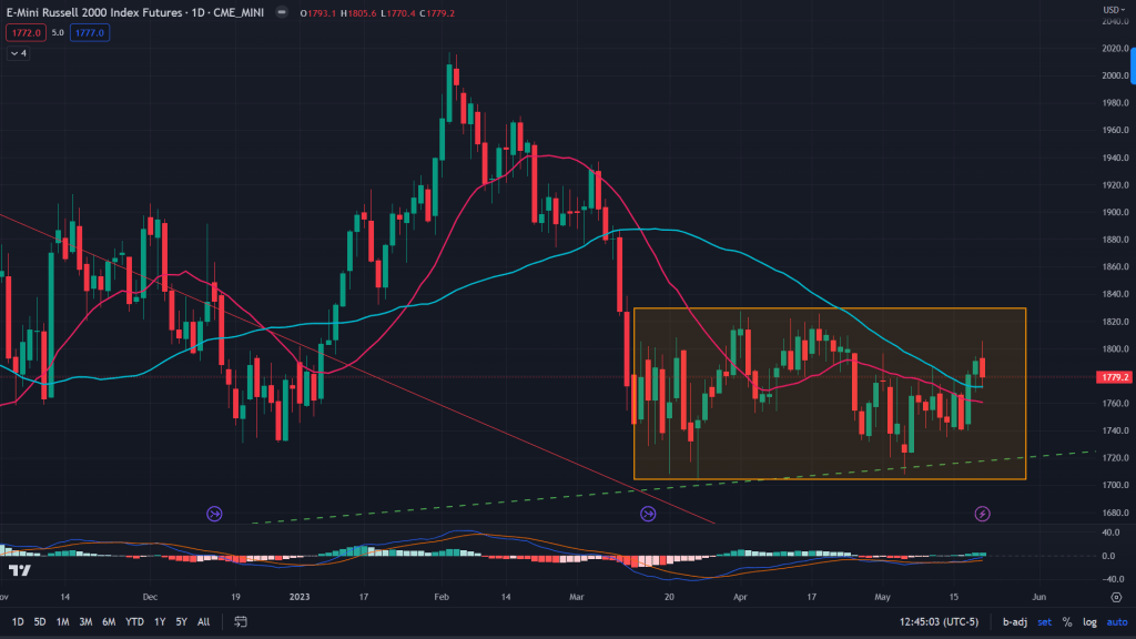
RTY (Daily): When smallcaps don’t perform with largecaps and it keeps languishing for days/weeks on a trot.. that’s a sign to be careful about. What we see on the chart below is a low base being formed. A low base is a pattern where a stock/index consolidates after a period of downtrend. Breakdown of this pattern usually leads to sharp fall in the days/weeks ahead.
Conclusion: Even as ES, NQ have broken out of their long facing resistances, this rally is very shallow not as broad as one would want in a new bull market. No participation from many largecaps and small caps languishing is a typical of bear market rallies. I would start trimming my longs from here.
Charted below are some of the charts of US bonds:
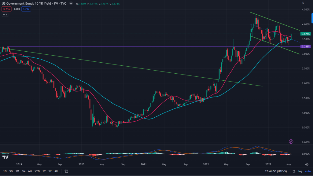
US 10-year bond yield (Weekly): 10-year yields are forming a bull flag on the weekly charts, along with taking support of the monthly demand line of 3.252%, which is a bullish sign for the yields (bearish for the markets).
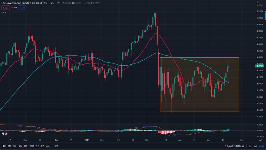
US 2-year bond yield (Weekly): While 10-year yields are expected to rise from here, 2-year notes are show a bearish sign. Which means the peak on the interest rates is in and we should see rates coming down from here.
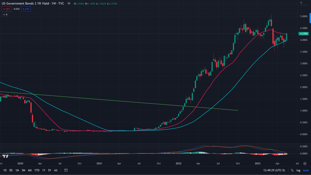
2-year bond yield (Daily): 2-year yields are forming a low base after falling sharply in their March peak of 5%. Formation of a low base tells us that there is more downside left for 2-year yields.
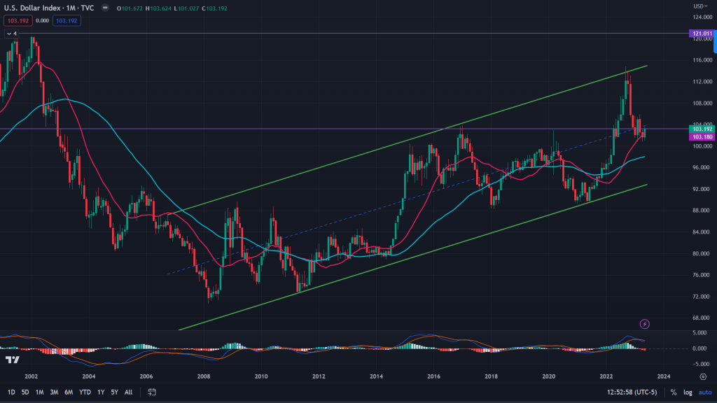
Dollar index – DXY (Monthly): DXY’s monthly chart is following this upward sloping channel for last 15 years and is now languishing around its 20MA and the monthly demand line of 103.18. I would expect prices to show some sign of a bounce from here.
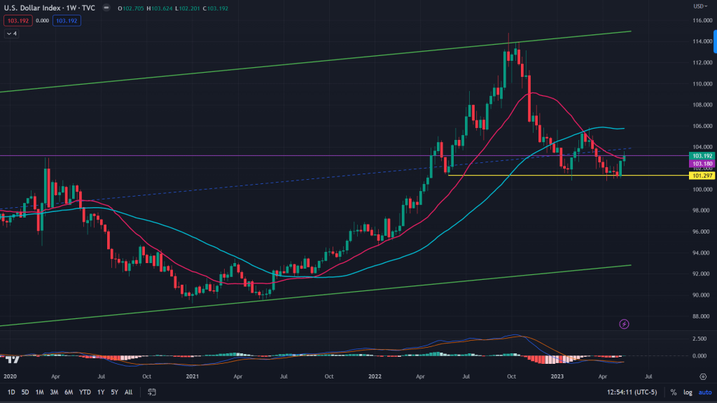
DXY (Weekly): Weekly demand line coming to the rescue around 101.29.
DXY (Daily): While on the daily, there is falling wedge on the verge of breaking out.
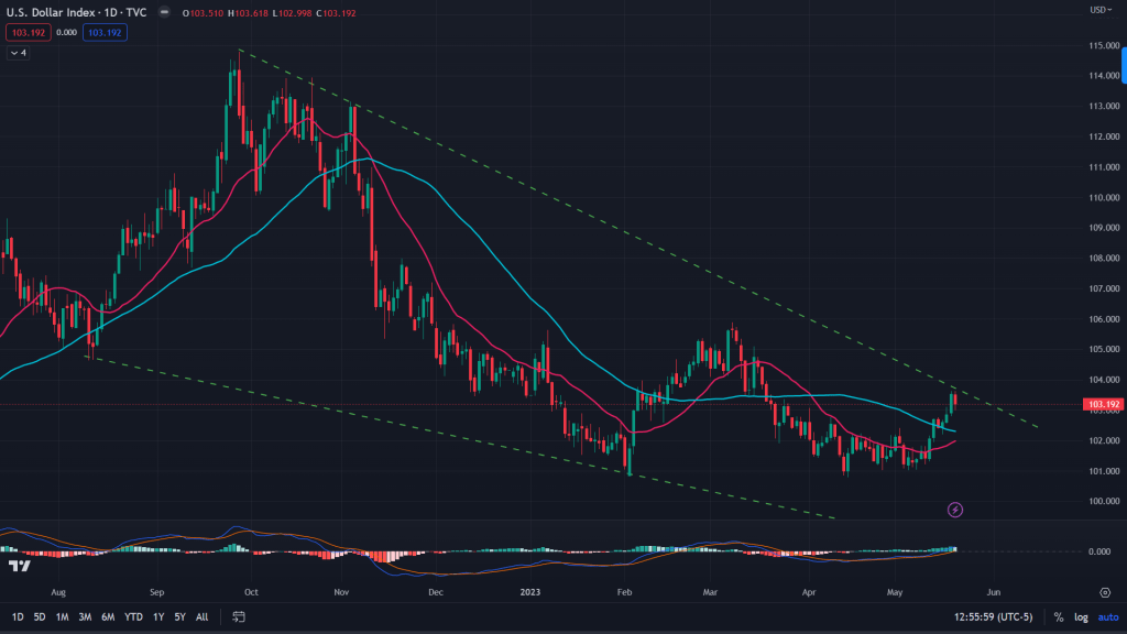
Conclusion: Just as stocks have broken out, 10-year yields are forming a bullish flag on the weekly while dollar index is on the verge of breaking out of its falling wedge. Why would somebody want to place their bullish bets on the stocks here?
Weekly markets update with Mukund Mohan

Leave a reply to trojanmanoj2 Cancel reply